
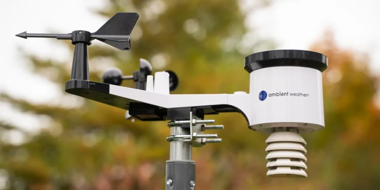
The HCLIM database contains the original meteorological records of thousands of weather stations based in 118 countries around the world with some of the records going back into the 19th century. This database had no records from Antarctica so we added in the data from Turner et al, 2019.
Of 1427 stations in this database that have reasonably complete data since 1970, 1379 of them show a warming trend and only 48 show cooling.
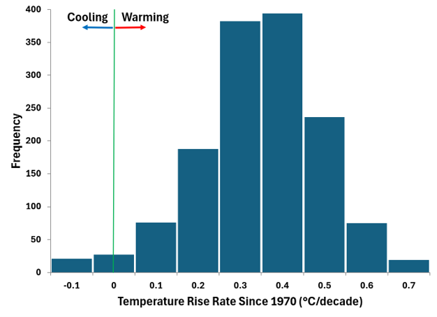
Imagine tossing a coin 1427 times and only getting 48 heads. You wouldn’t take seriously a claim the coin was fair, so you also shouldn’t take seriously any claim the world isn’t warming.
However, you may notice from the map below, that most stations are in the Northern Hemisphere. You might also notice that a bigger percentage of stations show cooling in the Southern Hemisphere; especially in Antarctica.
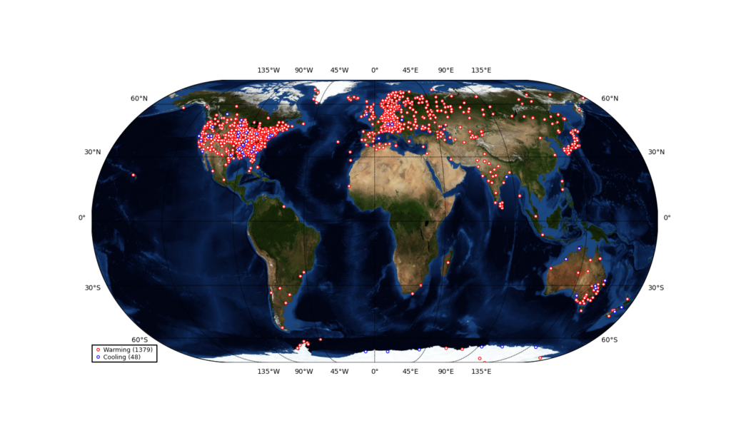
It’s therefore worth looking at the hemispheres separately and also taking a specific look at Antarctica. It turns out that 98% of Northern Hemisphere stations are warming compared to 79% of Southern Hemisphere stations and 65% of Antarctic stations.
So, the Northern Hemisphere is massively dominated by warming stations whilst the Southern Hemisphere also shows mostly warming but to a slightly smaller extent. In Antarctica a third of stations show cooling but that still means there are twice as many showing warming.
The overall pattern is clear. All land regions of the World show warming even though this signal becomes a little less pronounced as you go south.